The Panama Papers scandal erupted in 2015 after an anonymous whistle-blower nicknamed “John Doe” leaked over 11.5 million documents from a law firm in Panama called Mossack Fonseca. The documents, published by the International Consortium of Investigative Journalists, revealed a huge web of over 214’488 shell companies, that were partially used for the purpose of fraud, tax evasion and escaping international sanctions.
The documents also implicated several high profile personalities in the affair, such as sportspeople, actors and even the Queen of England. They also showed that several people and companies blacklisted by the U.S. government, for crimes such as collaborating with drug lords, terrorists or “rogue nations” such as Iran and North Korea, used these shell companies to escape sanctions. More importantly, they revealed that a large number of politicians, many of whom were campaigning on anti-corruption platforms, were also involved. Some notable mentions were the prime minister of Iceland, the king of Saudi Arabia, former British Prime Minister David Cameron, and Chinese President Xi Jinping.
The whistle-blower claimed that his reasons for leaking the documents were primarily the growing income inequality worldwide and his newfound understanding of the injustices and corruption that were taking place. This begs the question, can we explain the involvement of a country in this affair by studying socioeconomic indicators? Is it simply high taxes that led these poor rich people to hide their money away? Are people in richer countries more likely to be involved? Is it really Panama that’s at the center of all of this? These are a few of the questions that we’ll try to answer by analyzing Panama Papers data.
What was in the data?
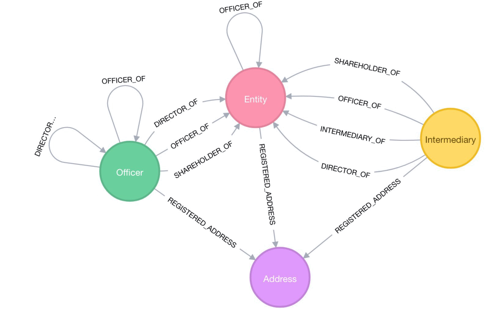
We had a total of five Panama Papers datasets at our disposal. These datasets represent a graph, with three datasets containing three distinct types of nodes, as well as a dataset containing edges linking the nodes. The nodes are people and organizations involved in the Panama Papers. The fifth dataset contains the addresses of these people and organizations. Here’s a breakdown on the three types of nodes we have:
- Entities: offshore entities are companies, trusts or funds created by agents in low-tax jurisdictions that typically attract non-resident clients through preferential tax treatment. Agents are firms in offshore jurisdictions that manage offshore entities at their clients’ request.
- Officers: officers are people or companies that play some role in an offshore entity. These are typically shareholders and beneficiaries of the offshore companies.
- Intermediaries: intermediaries are the lawyers and service providers who helped set up offshore entities.
It’s a bit tough to imagine this all, so here’s an idea of how to picture the data:
Now that we know what we have to work with, let’s have a look at what the data can tell us.
Which countries were involved?
The very first question we asked ourselves was which countries were involved in the scandal and to what extent. Was it the usual suspects? Was it mostly rich countries? There are many ways to quantify their involvement, but our first attempt was to simply count the number of people and organizations involved and group them by country. This yields the following bar chart:
Or, when plotted in a world map:
By looking at these results, it seems that the most involved countries are a combination of the most populous countries in the world and tax havens.
We see little Switzerland almost in the lead, which seems to reinforce many of the clichés about the country. It seems that cheese and watches are not the only thing Swiss people are good at. Similarly, Monaco, Luxembourg and British Virgin Islands are also present. And very near the top, we see Panama, which makes sense given the name of this affair.
On the map, we also see that there is a significant presence of geographically large countries, such as China, United States and Brazil. This isn’t unexpected, as big countries tend to have larger populations and will thus naturally have more people involved in Panama Papers when compared to countries with small populations. However, this isn’t always the case, as we can see that India didn’t even manage to crack the top 15 list, even though it’s the second most populated country in the world. This suggests that population alone doesn’t tell the whole story, but we will look at this later. For now, let us look at the same data but normalized by population:
This data is much easier to interpret. We see that almost all of the countries on the top 15 list are countries that are typically known as “tax-havens”, such as Seychelles, Cayman and Bermuda. We see however that all of them are dwarfed by the British Virgin Islands. For such a small island, being on both top 15 lists shows that it was surely heavily involved in this affair.
This data indeed is corroborated by many news reports, which seem to suggest that Panama, Switzerland, United Kingdom and many Commonwealth islands, particularly British Virgin Islands, were the countries most heavily involved in setting up this whole scheme.
So, if population alone is not enough to explain the involvement of a country in Panama Papers, can other socioeconomic factors explain this? Let’s have a look.
Is it only the rich that are involved?
We want to understand why some countries are more involved than others in this affair. To do so, we will study the correlations between the amount of involvement in Panama Papers of different countries and different socioeconomic development indicators. We considered several different socioeconomic factors, but ultimately we decided to focus on the following ones:
- Human Development Index
- GDP per capita
- Gini coefficient
- Income held by the richest 20% of the population
We obtained these datasets from the United Nations and the World Bank open data websites.
We will now display scatter plots, with which we will try to find correlation with the number of occurrences in the Panama Papers. We decided to use the number of occurrences in the Panama Papers of a country normalized by its population size to avoid the bias brought by countries that have large populations, as discussed above.
GDP per capita
GDP per capita is the value of all the goods and services produced by a country in one year normalized by the population size. It therefore represents approximately how rich a citizen of a country is. We chose to use this indicator because we thought that richer people might have more incentive to try to evade the tax system. We will go deeper in this analysis later on.
Now, we’ll have a look at the scatter plot of GDP vs number of occurrences normalized in the Panama Papers:
There is no evident correlation even if the numbers suggest it. Most of the countries have a relatively low number of occurrences in the Panama Papers and there are a few outliers that are significantly distorting the plot. Those outliers are again mainly either tax heavens or countries that were involved in Panama Papers for reasons of tax avoidance (British Virgin Islands, Luxembourg, Bermuda, etc.). As the plot shows the number of occurrences normalized by population, we would expect such countries to stand out because they have a small population and a very high involvement in the affair. Since we are interested in finding general patterns, we’ll remove the outliers to study the correlations for the majority of the countries.
Even though the numerical correlation is lower in this plot, we can better see a pattern visually. We observe that countries where the GDP is higher appear more often in the Panama Papers. Again, this is what we would intuitively predict. Richer countries usually have better infrastructure and therefore have a stronger tax collection system. This provides a larger incentive for rich people to try to evade these systems, which leads to scandals such as this one.
We want to see if it’s really the countries that have greater inequality, with larger relative amounts of rich people that are present in the Panama Papers. To do so, we’ll study correlations with two inequality indicators: the Gini coefficient and the income held by the richest 20% of the population.
Gini coefficient
The Gini coefficient measures the inequality in the distribution of wealth in a country (lower coefficient means lower inequality). The most equal equal society is when every person has the same income, with a zero-value coefficient.
This time we directly show the scatter plot having removed the outliers by using the techniques we described above.
How strange. There is almost no correlation between the two variables as both the plot and the numerical correlation suggest. This is quite surprising, since our initial assumption was that countries in which there is greater levels of income inequality would be more heavily involved in this affair. We assumed that uneven wealth distribution is strongly correlated with greater tax evasion and thus with greater involvement in this affair.
Let’s see if we have similar observations when looking at the income held by the richest 20% of the population.
Income held by the richest 20%
This index also measures inequality but it quantifies it differently, by expressing the share of wealth held by the richest 20% of the population. We would expect similar results as for the Gini coefficient since both indicators measure wealth inequality.
We can see that there is almost no correlation between the involvement in Panama Papers and the wealth held by the richest people of a country, which is coherent with what we observed for the Gini coefficient. Unfortunately, we do not get anymore insight by using this metric when studying the involvement of a country in Panama Papers.
We opt for a more traditional indicator of development, maybe we will find something there.
Human Development Index (HDI)
The HDI is used to represent how developed a country is, by considering the life expectancy, education level and GDP per capita of an average citizen to compute the index.
Both the plot and the numerical correlation suggest that there seems to be a correlation.
This is the most representative plot we have found thus far, where we can visually see a correlation. It seems that for an HDI that is greater than 0.65, which is often used to signify that a country is developed, there is a big increase in the number of occurrences in the Panama Papers.
One of the reasons for this could be that countries with higher HDI generally have better tax systems to ensure that taxes are paid. Additionally, a country with higher HDI is home to richer people since the GDP per capita is also taken into account in the calculation of the HDI.
Or maybe it’s simply that rich people prefer to live in developed countries?
Having looked at multiple socioeconomic development indicators, we saw that the wealth inequality is not at all correlated to the presence of a country in Panama Papers, which was surprising. However, there is a noticeable correlation with a country’s presence, when studying GDP per capita and HDI.
Maybe we can’t find out much about the countries involved by studying socioeconomic indicators, but we are convinced that we can find a significant amount of information about countries involved by studying how they interact with other countries in the affair. Let’s have a look at these links, shall we?
Making connections
One of the most representative measures of displaying international links is using a world map. Below, we display a world map with undirected edges representing the number of connections between any two countries, with the width indicating the number of connections:
There is a clear transatlantic bridge being built between Central America and Central Europe. This isn’t surprising, considering that a large number of tax havens are situated in Central America and the Channel Islands, as well as Mossack Fonseca being based in Panama, and Switzerland’s global tax haven reputation.
There’s also a noticeable edge between China and Hong Kong. Having studied the data, this is majorly due to over 20000 edges originating in China and going to Hong Kong, justifying the magnitude of the edge. Having studied the types of links that originate in China and go to Hong Kong, it turns out that most of the links represent officers that are based in China, with their businesses in Hong Kong. This isn’t unexpected, since Hong Kong has quite low taxes, making it optimal for Chinese businessmen to base their businesses there, as it is close to China, both in geographical and cultural terms.
Interestingly, we also see some “international link hubs”, such as UAE, Seychelles and Samoa. These make sense, since Samoa and Seychelles are known for their tax haven reputations, and UAE is one of the largest international business hubs in the world, justifying a large number of international links.
Although this representation of international edges gives us an idea of who interacts with whom in a geographic sense, it would be interesting to see which country is the most important one in terms of international transactions. We refer on a network representation of international links to answer this question.
Who’s at the center of it all?
We want to know which country is at the center of most links. We display the international links between countries using a network representation, where each country is represented by a node and the links between countries are the edges. The size of a node is determined by its betweenness centrality, which is a measure of how central a node is, based on how often it acts as a bridge between any two other nodes in a shortest path. The opacity of an edge represents its strength, or the number of connections. Let’s have a look at what this gives us:
It looks like Christmas!
Turns out Hong Kong is the most central country, closely followed by Switzerland, and then the UK. Having seen the variety of international connections going through these countries in the previous graph, it isn’t surprising. What we didn’t expect, however, was that the next three largest nodes would be UAE, Russia and Jersey.
It is also surprising that both China and Panama have low centrality, and are thus barely visible on the network. Granted, having observed that China mainly interacts with Hong Kong, it makes sense for China to be significantly less central than Hong Kong.
So, where should we look?
We’ve had a thorough look at the countries involved in Panama Papers from a variety of perspectives. We’ve studied the involvement of countries with respect to population size, studied the development and inequality levels of the countries and we’ve studied how the countries interact with each other. Overall, we’ve spotted a couple of major countries recurring in our different analyses:
- The commonwealth countries had a significant role in the Panama Papers, having the highest involvement per capita
- More developed and richer countries generally tend to be more involved in the affair, regardless of the income inequality
- Countries with low tax for foreigners, such as Switzerland and Hong Kong, tend to be more central in the Panama Papers.
It seems that we were right, it really is the rich countries that were at the root of it all. At least now we know where to store our money.